If the technology related files tends to be translated word by word to ensure it is as accurate as the original text, then public signs’ translation is partly opposite. In my opinion, the technology files have the characteristics of accuracy, closely logic structured, etc. Each word carries a meaning and is seldom paraphrased.
But what’s the nature of public signs? Certainly almost everyone has seen the large traffic signs along roads, like “STOP”, “XX km to xx”, “DANGER”, sometimes with noticeable color so that drivers can see far away. The readers of technology files are quite confined to professionals while public signs can reach the public, kids and the old, illiteracy and highly educated, all walks of people.
From those traffic signs, we can get some hints on how to write a public sign. As it is expected to be read by the public, as concise, short, and clear as possible would be perfect for few people have enough time and interest to read long, unclear, unremarkable signs that are not directly related to them. Then, if we translate a public sign, original features should remain.
I noticed a large number of public signs in our country are more than five Chinese characters, which means their translation would be long. For example, in one dictionary version, “一慢二看三通过” was translated into “slow down, look around, and cross”. We can see this is a traffic sign but it might not follow its features. If a driver saw the English translation in some road, does he have sufficient time to finish reading before passing? The answer may be negative.
Thereafter, if we cannot keep original form, then according to Nida’s “Dynamic equivalence”, we should more focus on function – readers’ response. It is a sign to inform drivers and walkers the accurate process of watching out the traffic condition. If we can find a concise phrase with the same effect on drivers and walkers, it would be the very one, like “SLOW DOWN”, ”STOP” or maybe you have a better idea.
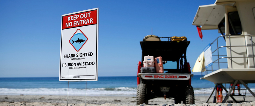
For those promotion signs across or alongside a road, on the wall of a tall building, they should be attractive and easy to be memorized, such as brand names, fascinating pictures, or either short, smooth sentences. For those tell the public not to do something, words should be compelling like “NO SMOKING”, “DO NOT ENTER”, quite simple and clear. As to an information sign in scenic spots, it should also be large and short enough for the crowds to get in a short time.