General Introduction to DTP
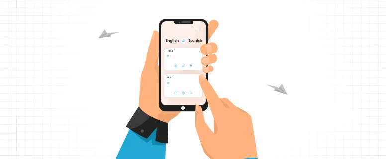
The DTP is short for desktop publishing. The meaning of DTP is also same as desktop publishing. The DTP contains the functions of a text typesetting, a color separation images, the graphics editor synthesis, the creative design and the output color pictures or color separation. The DTP is very simple and popular service.
Photographic plate is in the past, electricity sub-plate, and even the page make-up system cannot be compared. It provides printing, publishing, packaging, advertising and design industry to bring a glorious future.
General sense of the desktop publishing refers to the computer system for text editing, layout and graphics, image processing, and complete the requirements of the layout in line with published work. And specific to the localized area of desktop publishing, refers to the use of a language of the original document (such as operating manuals, catalogs, leaflets, etc.) in accordance with one or more of the target language to re-layout, the formation of different languages.
Has been published at this stage is not limited to paper, printing and publishing for the media, and to a broader cross-media publishing, including CD-ROM, Internet and other media for the dissemination of electronic publishing.
DTP is a new technology and it develops very rapidly in recent years; It has changed the traditional publishing process and methods. DTP is the use of computers for creative design, color image processing and complex layout. It makes all the prepress work of pen and paper be lost, and it also fully meet the professional requirements of the modern color publishing system.
As the DTP develops from the original film to a four-color prepress work all being placed in the computer and DTP printing through from design to all aspects, there are other high-speed printing ink on paper to a physical process, so the DTP computer designers pushed the front line in the printing plate.
This computer designers put forward higher requirements, in addition to asking them to design capabilities of the professional art, it also requires other knowledge, especially in the color separation printing, hanging, overprint, make-up knowledge, etc., to be able to accurately faithfully reproduce the original.
The details of the DTP is below:
1: The Types of Ducuments:
There are generally 6 kinds of documents that come in different DTP formats:
Brochures QuarkXPress
Ads QuarkXPress
Banners Photoshop, Animated Gif, Flash
Application Notes QuarkXPress/FM (exceptionally)
Check list Word
Press release Word
2: Font usage:
For specific language, the Font should be used correctly. For GE project, the GE font should be used.
3: Graphics/Images
Images and graphics must remain in the same position as in the Source: these must not be moved or changed neither size nor shape.
4: General DTP guidelines
Check that all the graphics and the color backgrounds have the same position as the ones in the English files. The graphics and the colored backgrounds must not be moved. When inserting manual hyphenations, do not insert the “-“ symbol, but rather use the “Ctrl” + “-“ keys, which creates a hyphen only when it is needed and removes it automatically if the position of the text changes.
The title of the chapters that appear vertically on the side of the pages must be on the left for left pages and on the right for right pages. Graphics, tables and text should not be too close to one another: insert more space before the paragraph if it is possible, move the table up or down or reduce the space between words to arrange it and make it more “aesthetic”; however, no matter what you do, the graphic must not be moved.
Text must not run into the graphics. To avoid that, you can insert soft returns and reduce the font size and leading. If you do these changes, please make sure the page layout stays visually consistent, i.e. there must be no paragraphs that look different from others.
Please check that the “TM” and the signs are there and in the correct position. Pay special attention to the subscripts and superscripts, such as in chemical formulas.Make sure that chapter titles and subtitles are consistent in the header of the whole chapter.Make sure the graphics are exactly the same, also the background, as in the source files.
When adding a text box to insert a translation over a graphic, make sure it completely hides the source text below (zoom in quite a lot to see it better). Check that the graphics do not partially hide the captions. Every paragraph in the body text should be correctly aligned on the left (vertically), as well as the paragraphs on the left or right margins should be.
Pay special attention to the alignment of elements such as coloured lines or squares that appear at the bottom, on the side, or at the top of the pages, they must not be moved. In lists or in tables, make sure that no empty line appears. Please do not insert a soft line break if there is enough space to fit the entry and the page number in one row (Use the Tracking feature in Quark if appropriate).
If there is a change in the body text do not forget to introduce changes in the index too, and always check the font since changes are not done automatically in the index